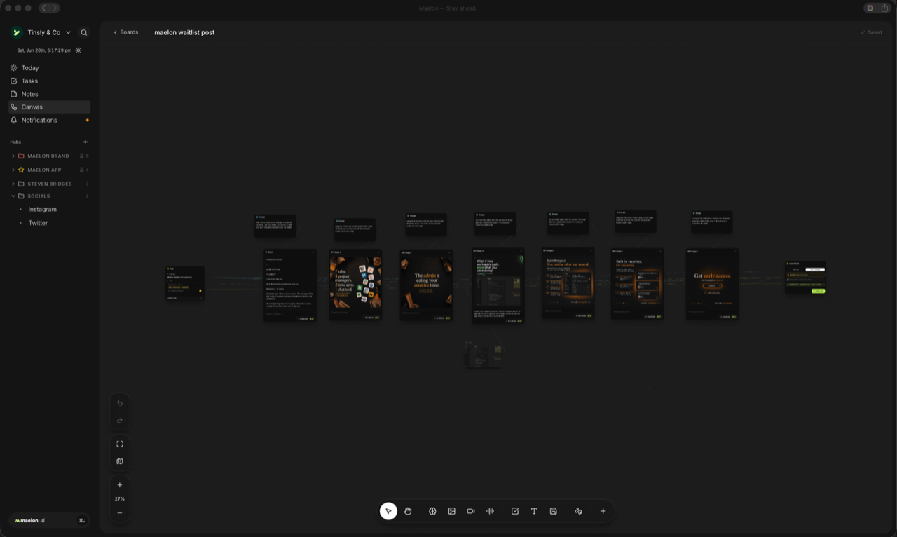
Introducing Canvas — your creative studio
FeatureMaelon has always been where you plan your work. Today it becomes where you make it.
Meet Canvas: a creative studio built right into Maelon. Open a board and generate images, video, and voiceovers with AI on an infinite canvas — then drag what you make straight onto your tasks. From a spark of an idea to a hero image to a storyboard to a script, it all lives in one place, connected to the work you're already doing.
No more bouncing between ten different tools. Think it, make it, ship it — without ever leaving Maelon.
Quinn got a beautiful new look too, with your credits live at the top so you always know where you stand — and the whole app now feels great on mobile. This is just the beginning of Maelon as your creative studio. Much more on the way.